Digital publishing trends in government annual reports
Presentation makes all the difference in public engagement with annual reports. Interactive, digital-first publishing, eye-catching designs and animations are becoming more popular as agencies embrace innovative digital publishing techniques.
It makes sense to invest in digital publishing for content that communicates your achievements and shows the value your agency brings to the Australian public.
Curious about how other agencies are publishing annual reports online? We put together a list of innovative digital publishing inspiration from across the web.
Interactive summaries
Infographics are one of the most popular tools for online visual communication, and with good reason. Visual content grabs readers’ attention and helps them process information 60,000 times faster than text.
Some agencies are taking these principles a step further, using animated infographics to catch readers’ attention, and provide a quick snapshot of the year’s key achievements.
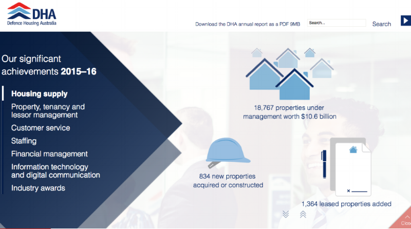
Defence Housing Australia won an award for its 2014-15 annual report, but took it up another notch for their 2015-16 annual report, illustrating major achievements through an interactive summary. See the summary
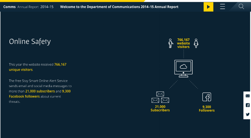
The Department of Communications 2014-2015 annual report profiles key projects such as online safety (pictured), NBN and more.
Colourful graphics

The Department of Foreign Affairs and Trade uses a map infographic to show its operations worldwide. More key facts are presented on the initial summary page, with browser navigation throughout the report’s header. See the report summary
ACT Health’s 2014-15 summary updates as you scroll along the page, providing quick insights into data such as staff numbers, investments and services delivered. ACT Health has shifted away from a corporate look and used bold and bright colours throughout. See the report
Digital-first publishing
While the downloadable PDF annual report still has its place, HTML publishing directly on websites creates an enhanced and easy to navigate experience for readers.
This includes flexible, scalable experiences that allow people to engage with your content on any device – essential for Australians who have one of the highest rates of smartphone ownership in the world at 70%.

The Department of Communications makes navigation easy through a large slide out menu in its 2015-16 annual report, accessible at all points throughout the browsing experience. See the report
The Department of Finance takes a different approach for their 2015-16 annual report, with a menu running down the left side of the screen. See the report
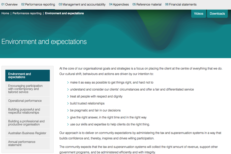
The Australian Taxation Office annual report uses both horizontal and vertical menus, and a clear and minimal layout. See the annual report
Agencies are going above and beyond to make annual reports accessible and engaging. Infographic summaries and HTML publishing are on the rise as technology continually evolves to make digital publishing even easier.
Find out how MasterDocs Annual Reporter enables publishing to multiple formats including HTML, Word and more – get in touch